Beijing 2016: A Travelogue
by David Bacisin, published
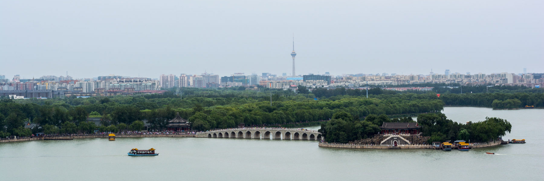
In July 2016, I had the opportunity to mentor Chinese college students during a two-week training camp where they learned about human-centered design and how to apply it to make positive social impact. I had several days to explore Beijing with and outside of the program; after I returned home, plenty of family and friends wanted to hear about my experience and see the many pictures I took. I created a mini-site to tell the story of my travels.
I took a mobile-first approach, with a focus on accessibility and performance without compromising the narrative or photography. Truly thinking mobile-first, I aimed to squeeze each page into 14 KB,1 which would allow people to start reading within 1 second of accessing my site on a 4G mobile network—I didn’t want my readers to wait the 9 or more seconds it takes to load the typical mobile website.2 I created vector graphics to introduce each section with a crisp, engaging silhouette while keeping within the miniscule 14 KB download size limit.
My main reason to create the site was to share photos, but I had one big problem: their download size. Paying per-megabyte for mobile data isn’t uncommon, especially if you are traveling outside of your home country. To save my readers real money, my image galleries download smaller images when accessed on smaller screens; while not a perfect heuristic, actually determining if the internet connection is metered is often impossible. Viewers can still click or tap on any image that piques their interest so they can enjoy it in full detail.
For those using screen readers or text-only web browsers (like Lynx), I made sure to include descriptive captions for each of my pictures—which resulted in better captions even for people who are able to see the photos. The image galleries are annotated for use with assistive technologies—and I had an enlightening experience testing some of those technologies myself.
With that, I invite you to follow me on a trip to China:
Footnotes
-
See
Mobile Analysis in PageSpeed Insights,
last updated 9 January 2018 on Google Developer Guides. Accessed 5 July 2018 at https://developers.google.com/speed/docs/insights/mobile ↩ -
See the introductory paragraphs of
How To Make Your Websites Faster On Mobile Devices,
published 3 April 2013 in Smashing Magazine. Accessed 5 July 2018 at https://www.smashingmagazine.com/2013/04/build-fast-loading-mobile-website/ ↩